ST MOTORSERVICE
That was a project from a client who has a repair shop. His wish was to make a simple, timeless, modern and unique logo with at least one engine part in it.
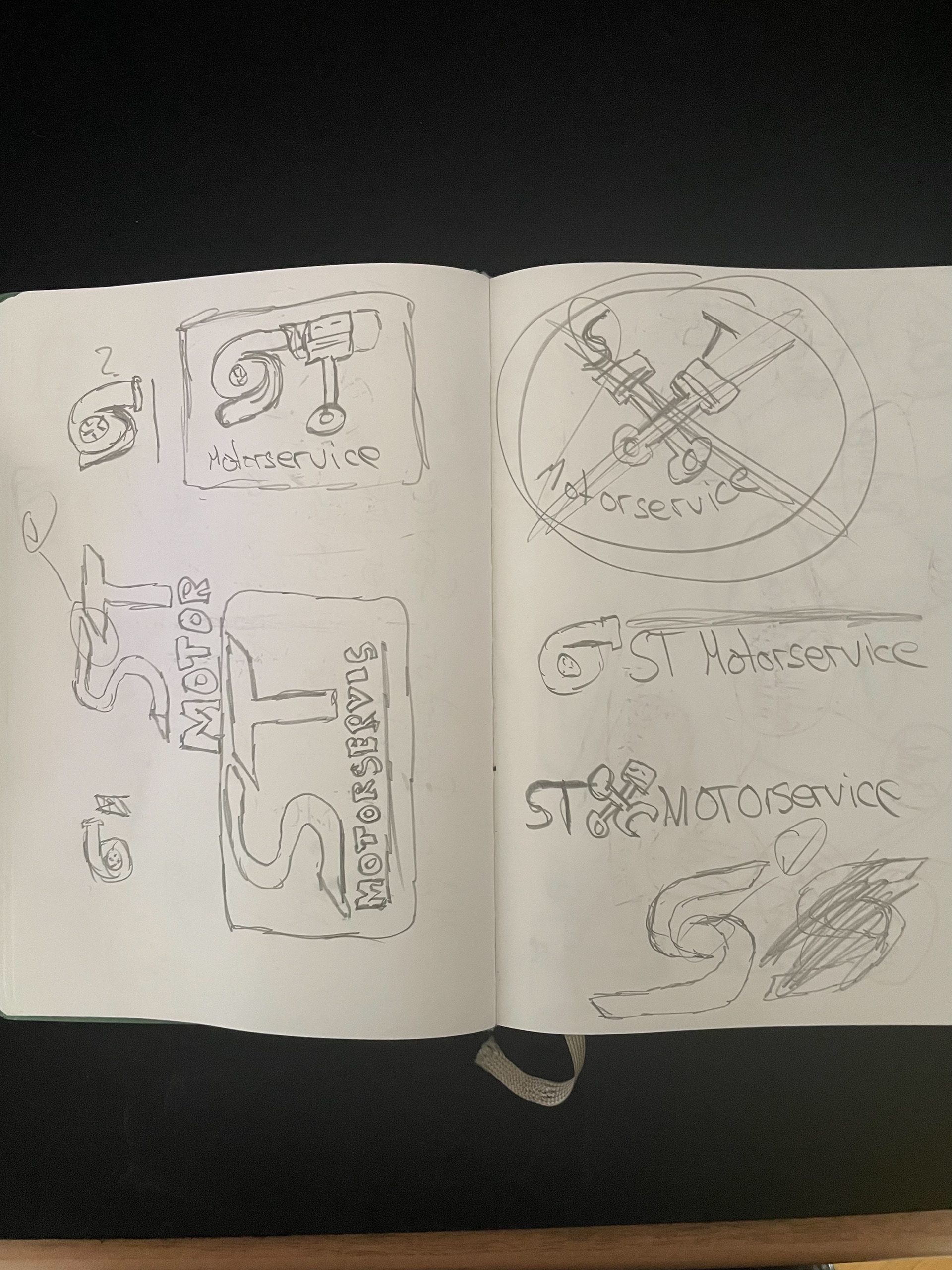
At first, I thought okay this is going to be easy but when I started I realized the seriousness of the situation. I thought, "I don't want to do a classic logo as you can find on google where are 2 engine pistons or the outline of a car".
So I started to scribble. First I wrote all words on the paper that has something to do with cars or engines. Then I started picking the words that you can draw in a logo.
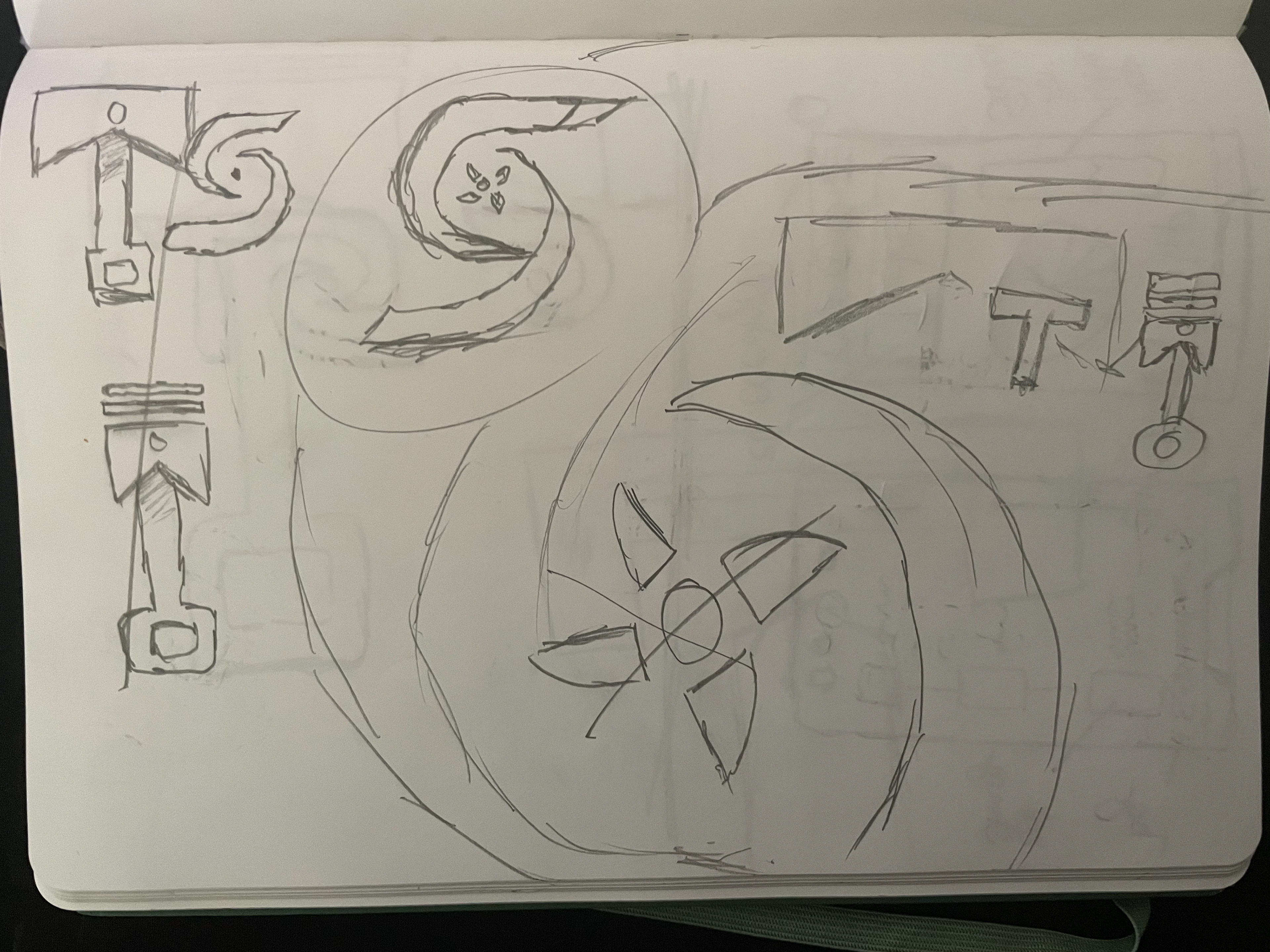
And then it hit me when I drew a Turbo. I was like "wow the turbo looks like an S, maybe I could use the Turbo with the letter S in negative space".
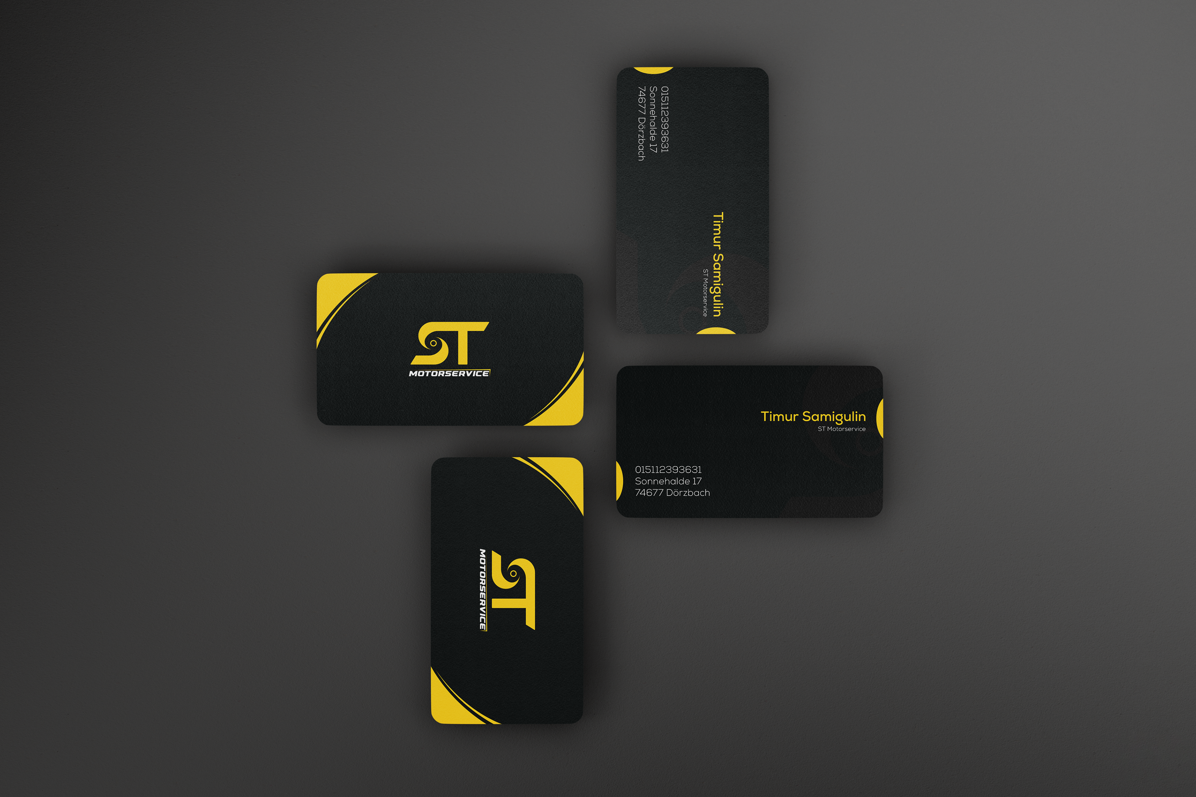
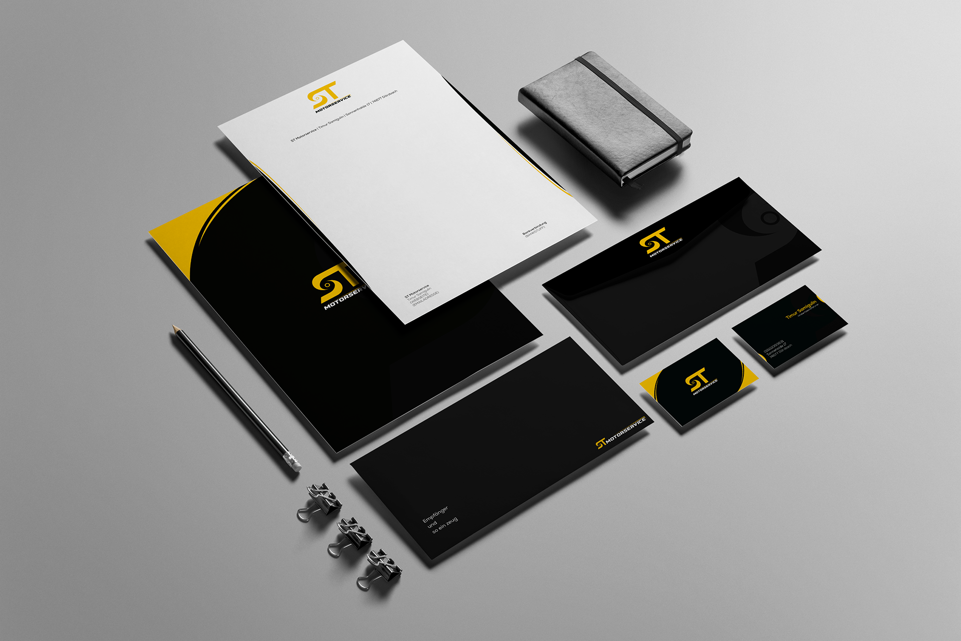
So I started experimenting and the picture on the left was the final product.